
Improving Government Website
This is the story of how I met both the users’ need for efficiently finding information, and the business’ need for decreased spending on hosting the website.
To comply with the NDA, confidential information has been omitted and obfuscated. This case study is published with the approval of the Government of Ontario.
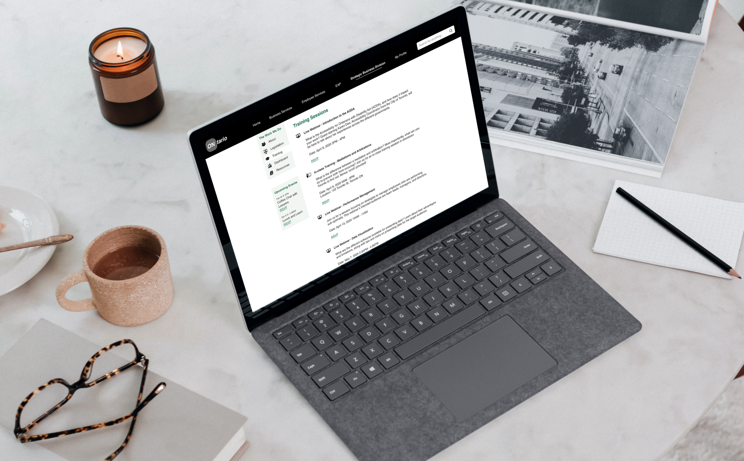
CHAPTER ONE
OVERVIEW
| At a Glance
My Role User Experience Designer at the Government of Ontario
Challenges Constraints with UI
Balancing user/business needs
Managing scope creep
Impact Increased page views by 22%
Increased event sign-ups by 14%
Increased savings on hosting
| Background
Employees at the Strategic Business Division (SBD) respond to dozens of inquiries from other government workers each month, on topics related to human resources and legislation.
| The Problem
The SBD had a website that provided all the necessary information in order to reduce the amount of questions the employees received, but users had difficulty finding the information.
This resulted in the SBD paying an unnecessary amount of money per year to host a website that no one accessed.
| Our Goals
I was tasked with redesigning the Division's website so that it is effortless and intuitive to use, while saving the business money.
This project's scope was to identify the issues surrounding the information architecture and user experience, map the potential solutions based off that research, and redesign and launch the new website.
| My Role
I led the redesign between June to October 2018 and collaborated with another designer, Rebecca. She mainly focused on the visual design while I tackled the experience design. The project was completed in the scheduled timeline, and the website re-launched in November 2018.
My design process for this project is shown below:

CHAPTER TWO
RESEARCH
| What We Already Knew
Before I started on this project, Rebecca had analyzed the tickets that users created over the years on the website, and some common issues emerged:

The issues that existed from the business' perspective were:
- budget - hosting a website on the government's intranet cost a fixed amount of money based on the number of pages. The SBD was looking for savings as they had a tight budget;
- events - although the website contained a page on events the Division is hosting, attendance was low.
| The Impact
Rebecca sent out a short survey requesting for participants, and I ended up sitting down with three individuals, and conducted one remote session:
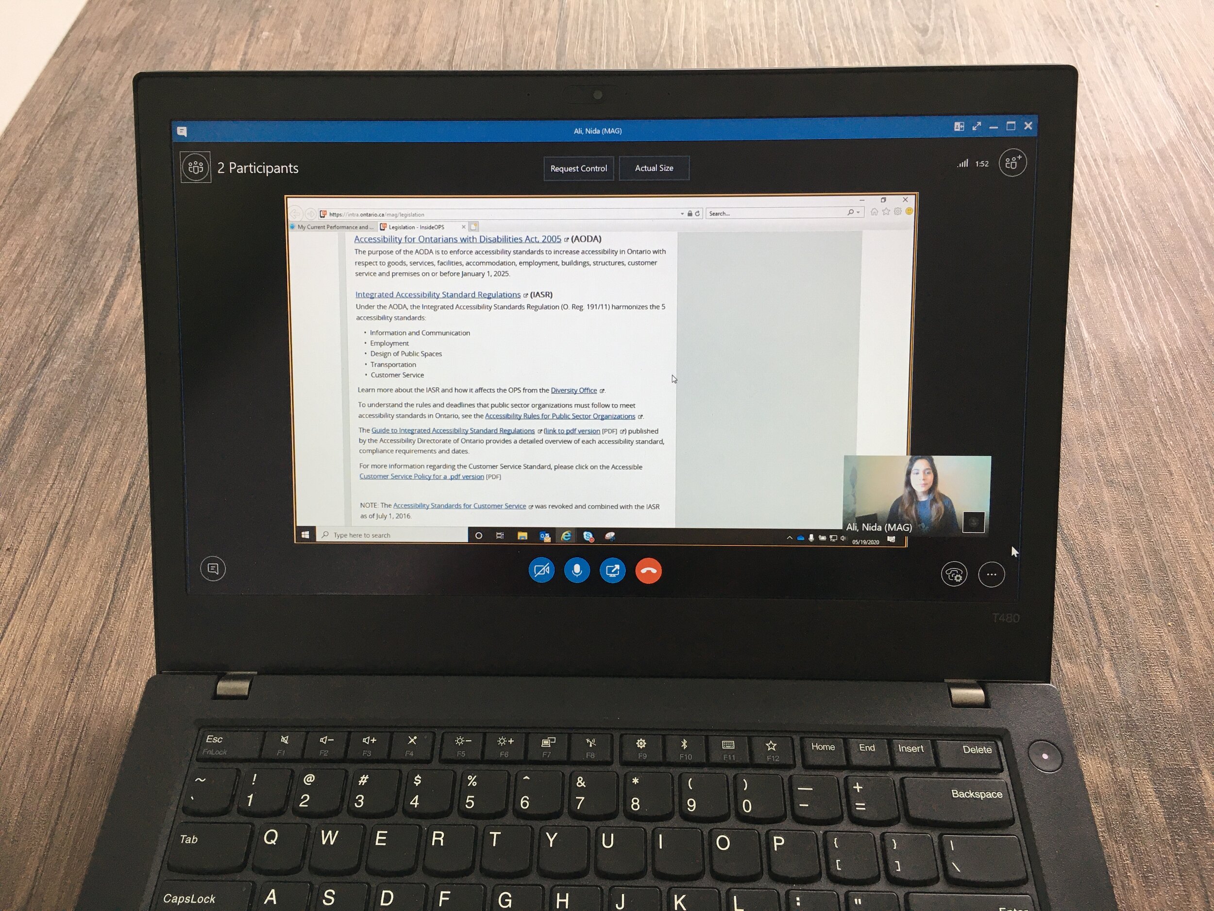
I wanted to understand the end users better, specifically in terms of how they work, how the website would support their work, who they work with, and what their frustrations were.
As an example, I learned that users frequently need to access the link to the AODA (an Act that governs accessibility laws in Ontario), so I gave participants the task of locating the link to the Act, and tracked the route and how long it took them to find it revealed problems which started with the fact that 75% of the users were unable to locate the link.
| Up Next
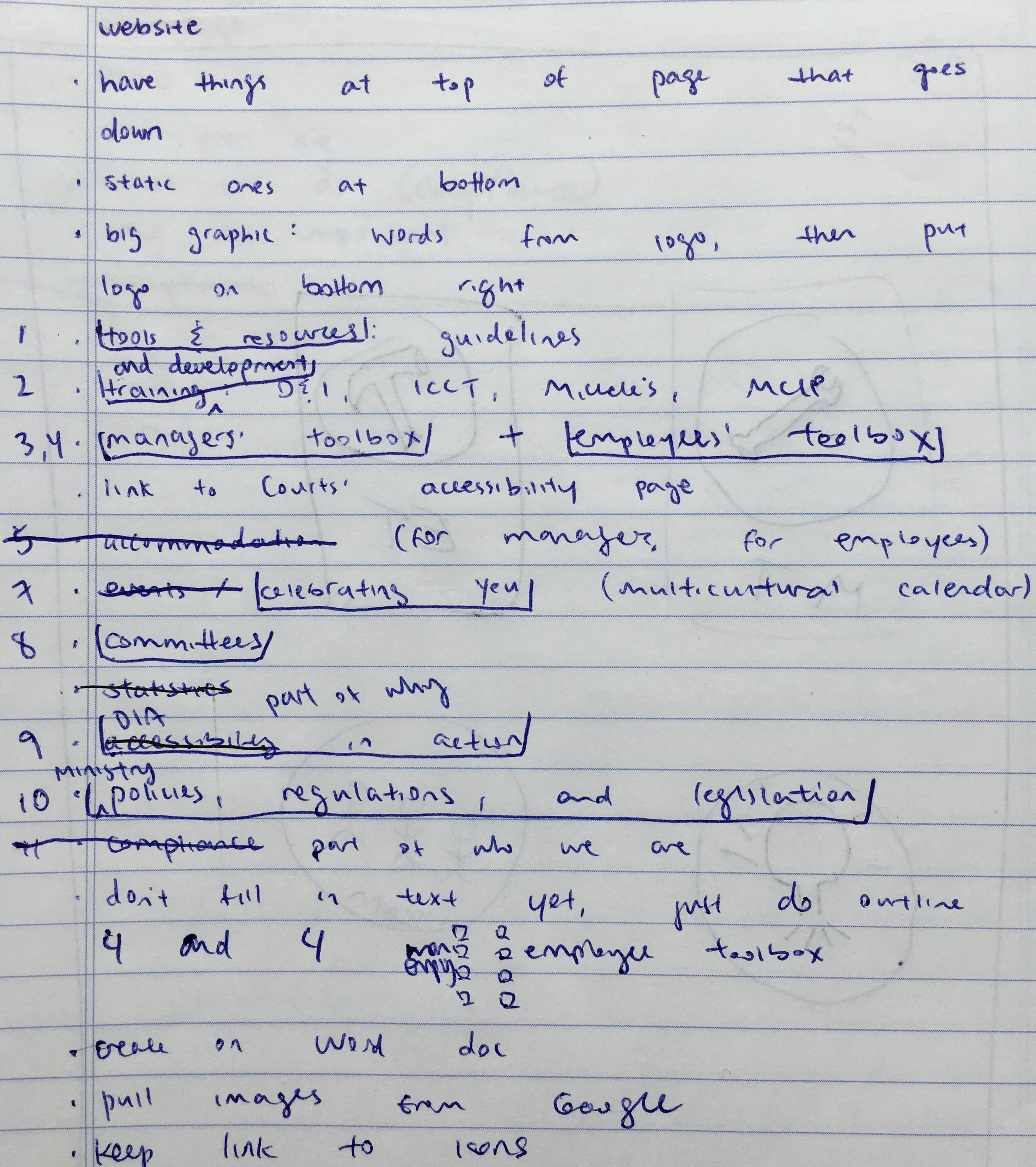
Through these meetings, I gained a deeper understanding of which features on the website bought the most value, along with their ideal end goals.
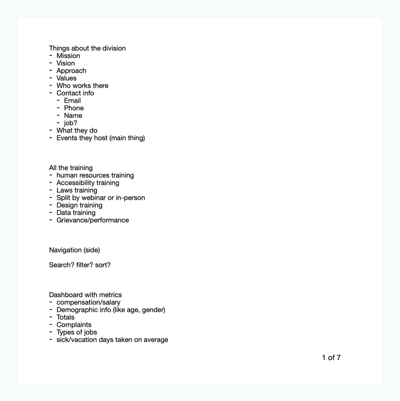
I then compiled a list of features, links, and content the website should have, based on meetings with users, the Coordinators who respond to inquiries regarding the site, and stakeholders:
CHAPTER THREE
IDEATION
| Information Architecture
I looked at the existing pages on the website, and found that there was duplicate information throughout the site. Since one of the business goals was to reduce costs associated with hosting the website, one method was ensuring that a piece of information appears only once.
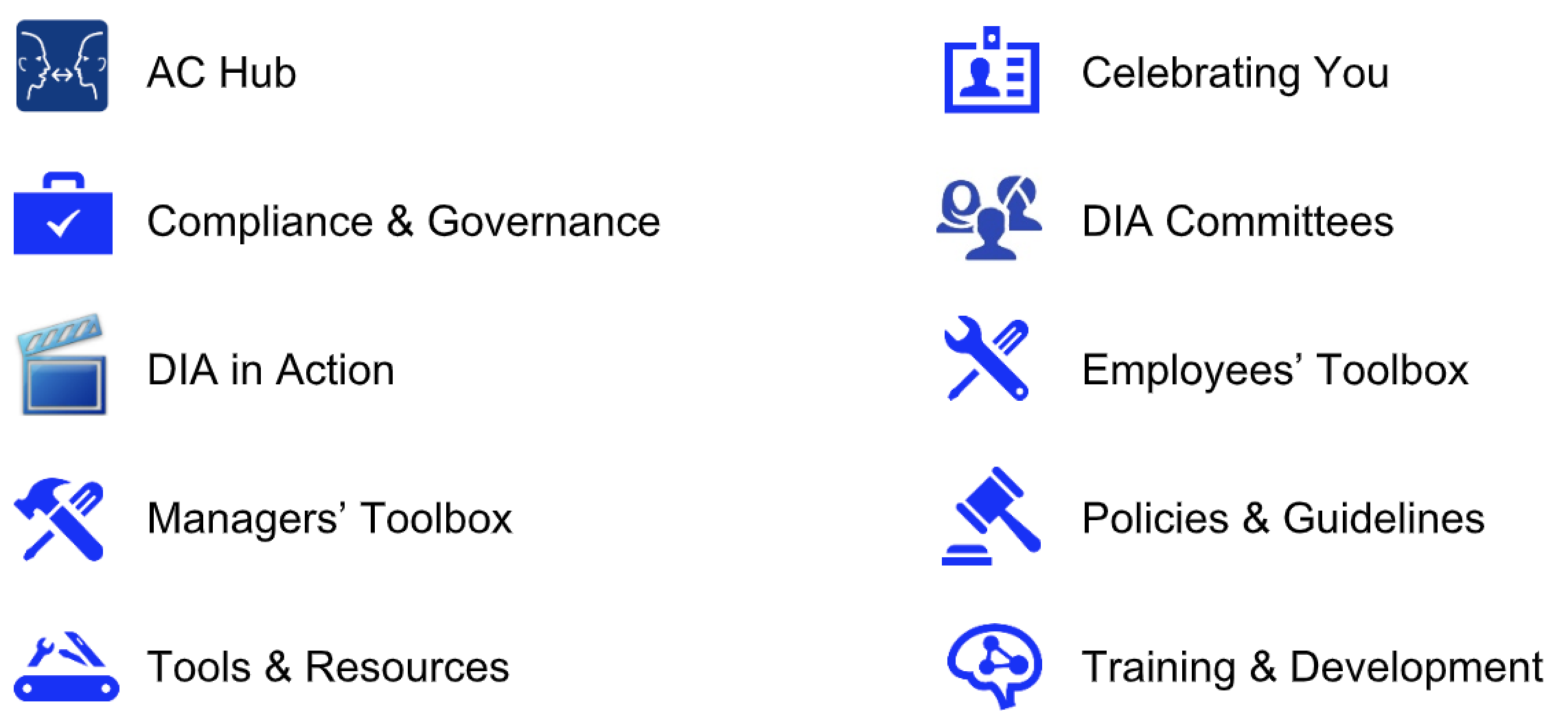
I knew I needed a new way of defining the information architecture; in order to determine which content can be organized with others, I looked at the existing information and came up with my own groupings, which comprised of nine in total.
For reference, the original website had 10 groupings:
| Open Card Sort
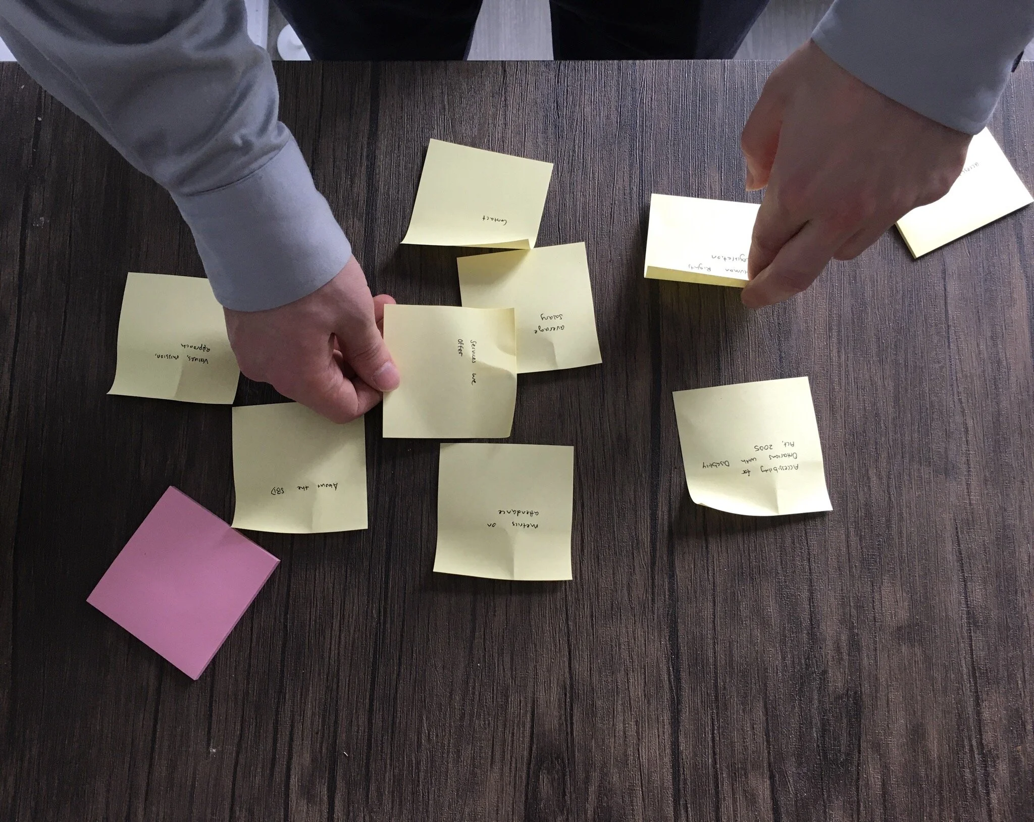
I wanted to validate my assumptions about the information architecture, so I conducted an open card sorting exercise with seven participants.
They were given a deck of 74 cards with no pre-established groups and were asked to sort them in any way they see fit (I also asked them to think out loud so their responses can be recorded and reviewed):
I also took the opportunity to ask the participants some open-ended questions after the card sort session:
- what are the top three tasks that you engage in on the website?
- what was your overall approach to organizing the cards?
- were there any items that are missing and weren’t included?
- do you have any additional feedback or comments that you’d like to include?
After all responses were collected, I organized the results into a Similarity Matrix (please note that I have intentionally obfuscated confidential data here; below is a simplified version):
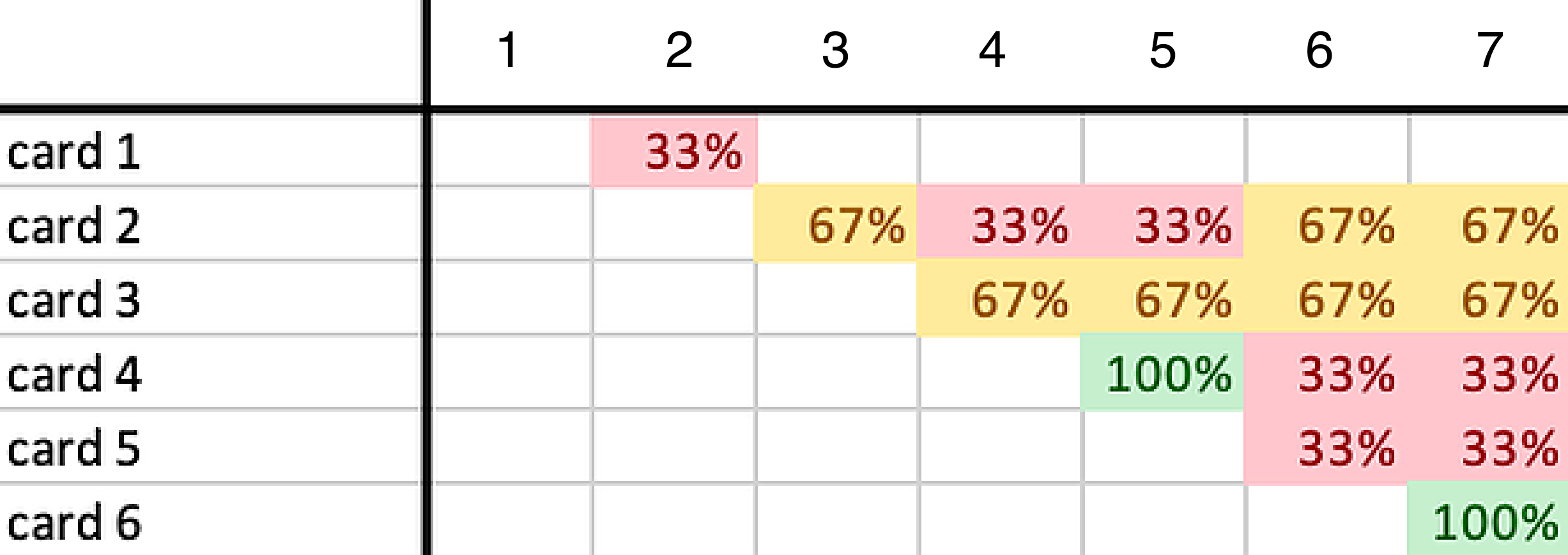
I was able to determine the 6 groupings for the website that made the most sense for users (icons designed by Rebecca):
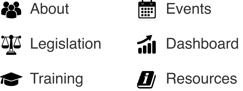
As it turns out, my previous assumptions were wrong! I'm so glad I did testing on this before diving into sketching and prototyping.
CHAPTER FOUR
PROTOTYPE
| Constraints with UI
The Government of Ontario had a handbook on design guidelines in which all UX and UI Designers followed.
This meant that there were some constraints with how the user interface looks:
- colour limitation - the colours had to be restricted to green, white, and black;
- no images - any images or illustrations (with the exception of icons) were recommended against;
- fixed banner - the top black banner was not modifiable.
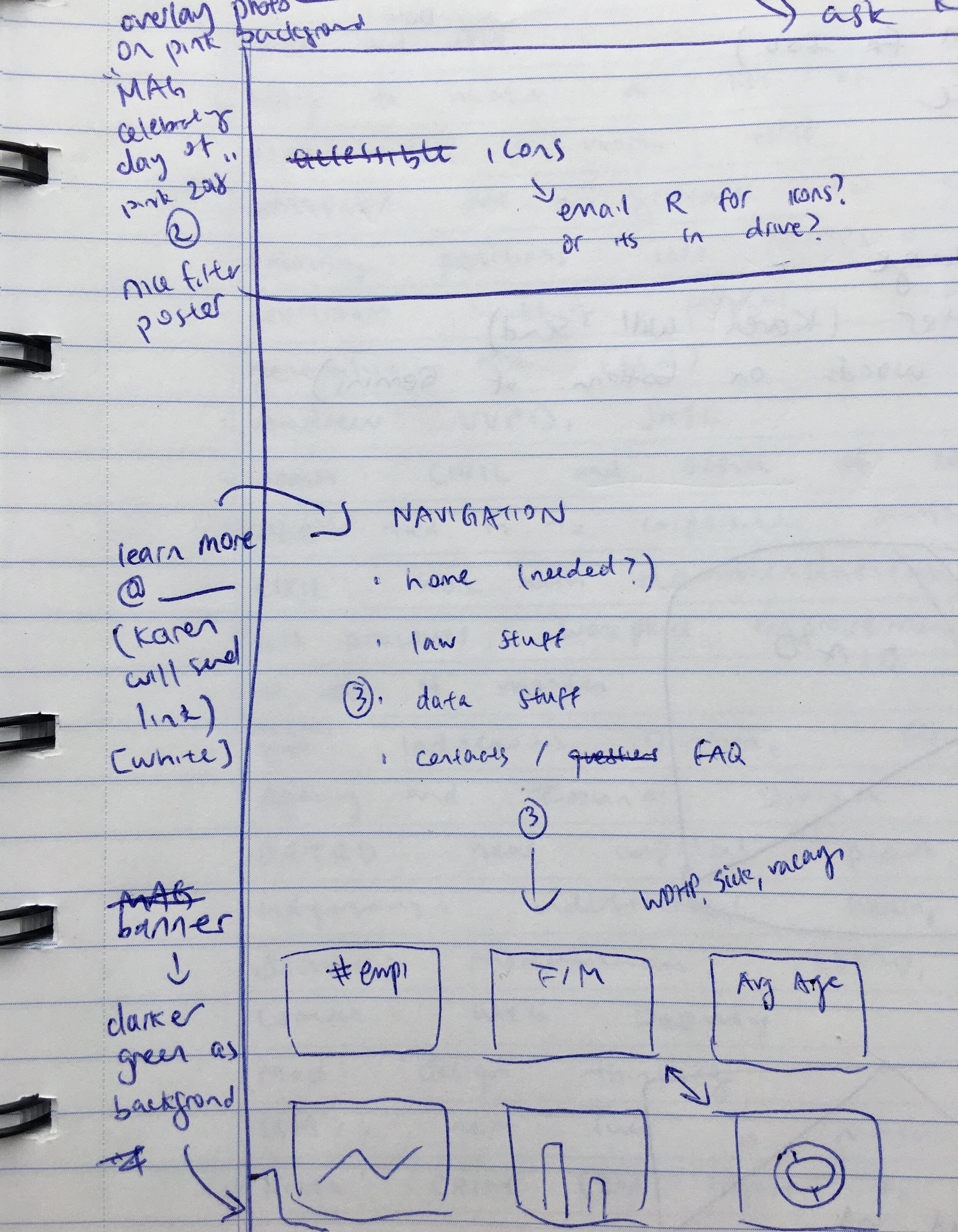
I started off with sketching some wireframes, and collaborated with Rebecca and Jackie to ensure the designs were feasible:
Because of compressed timeline, I worked rapidly often jumping straight from sketching to prototyping. The high-fidelity wireframes were created using Sketch and prototyped using InVision (with the exception of icons, which were originally created by Rebecca):
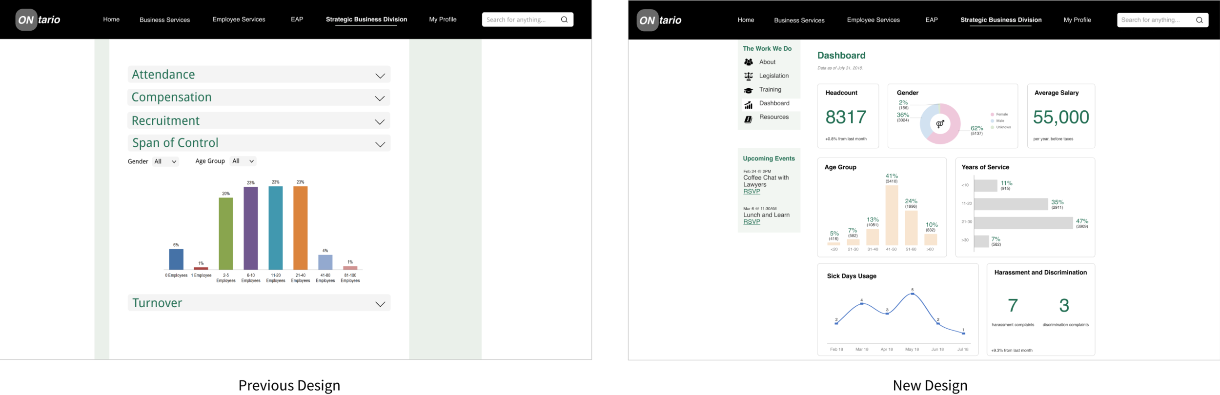
I exported the prototype from InVision to Zeplin, and worked closely with Jackie during implementation. From time to time, I adjusted the UI directly with HTML and CSS.
CHAPTER FIVE
TESTING
| The Launch
In November 2018, the website re-launched. It was great to see most of my work brought to life!
However, the project wasn't over yet - I wanted to conduct further testings in order to evaluate whether the user and business needs were met.
| The Impact
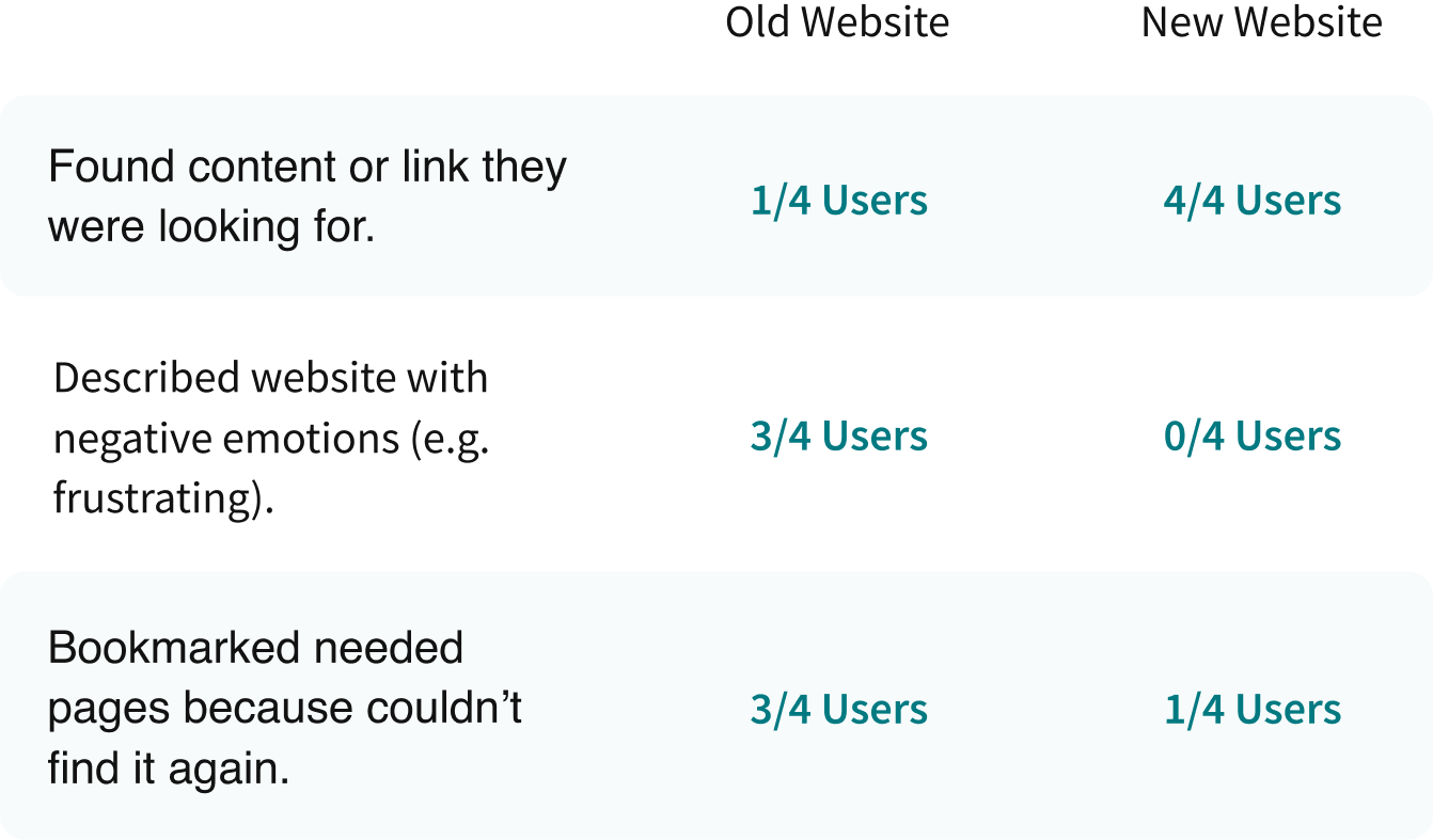
| A/B Test
One of the business needs was to increase attendance at the events the SBD hosted. To achieve this, I conducted an A/B test to compare two versions of similar webpages:
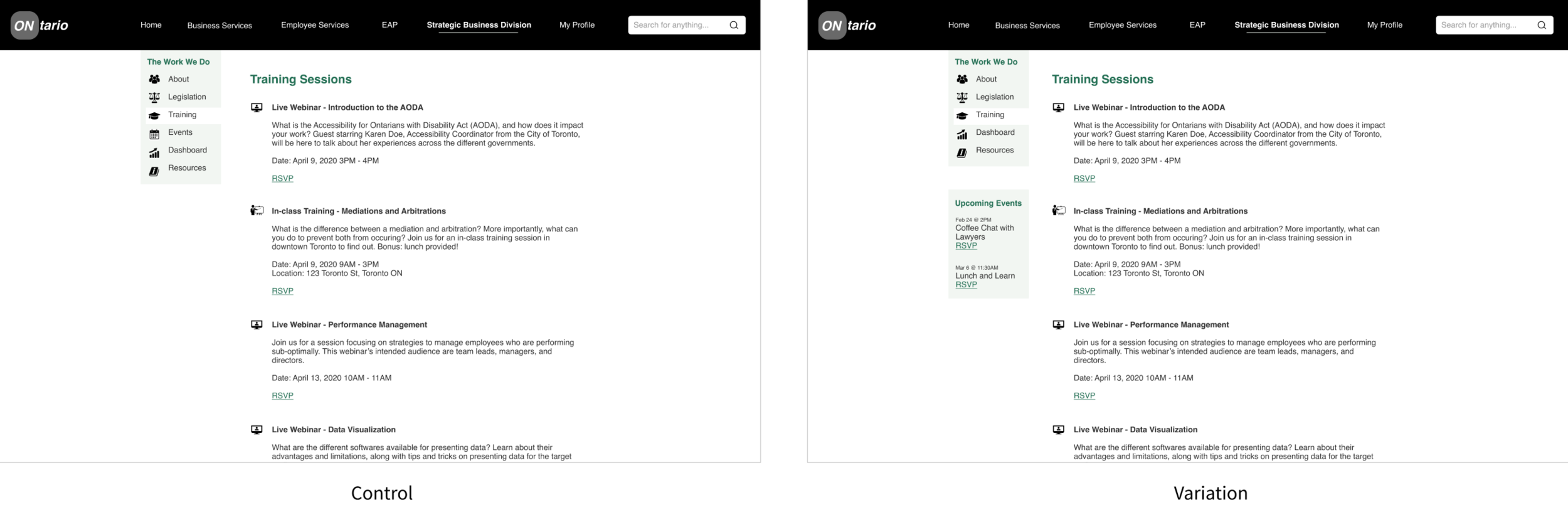
The question we wanted to answer was: to increase attendance, should "Events" be its own sidebar or part of the menu? After two weeks, we found an increase of 70% in page views and an increase of 30% in registration for the variation version (when "Events" has its own sidebar).
CHAPTER SIX
EVALUATION
| Were the Needs Met?
Previous usability testings showed that users now were able to find the information they were looking for on the website, and their satisfaction with navigating the site increased.
Looking at business needs, the reduced number of pages meant an increased savings per year for the SBD. My manager considered it a success, as it freed up the tight budget for other purchases. It was difficult to balance both the users' need of finding content and the business' need of saving money, so I was proud of what I achieved.
I set up Google Analytics in order to track the number of page visits since re-launch. We were especially interested in looking at how many visits there were to the Events section, as one of the SBD's goals was to increase attendance at various events they hosted throughout the year.
| Up Next
Below is a quick summary of our data obtained in the span of a month (please note that I have intentionally obfuscated confidential data here):
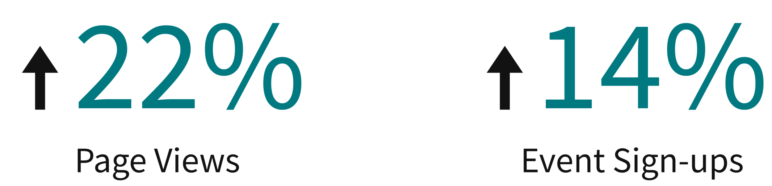
Overall, I'd say the project was a success as it had improved the users' experience and met the business' needs. However, with most design projects, continuous iteration to gradually improve the experience is needed - this is only step one.
CHAPTER SEVEN
CONCLUSION
| Final Designs
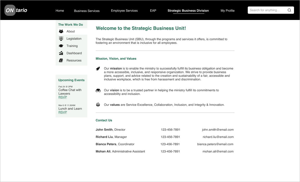
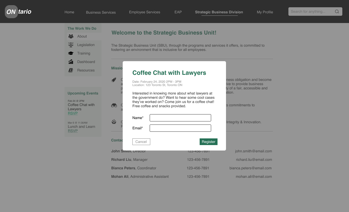
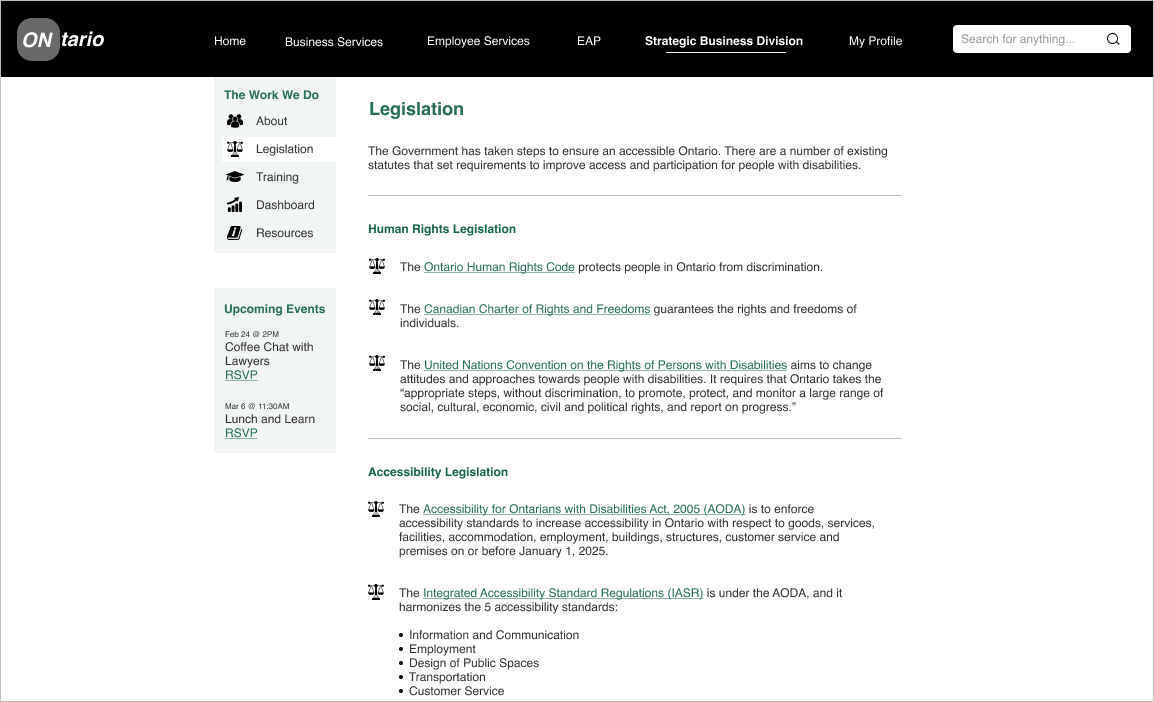
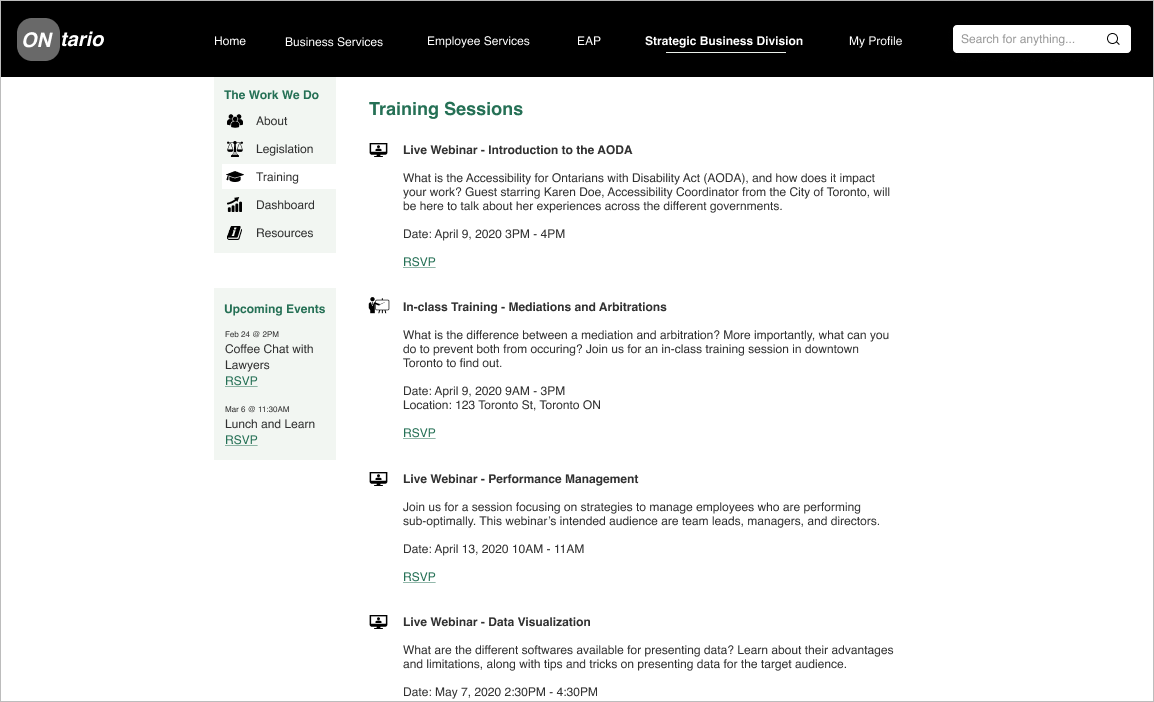
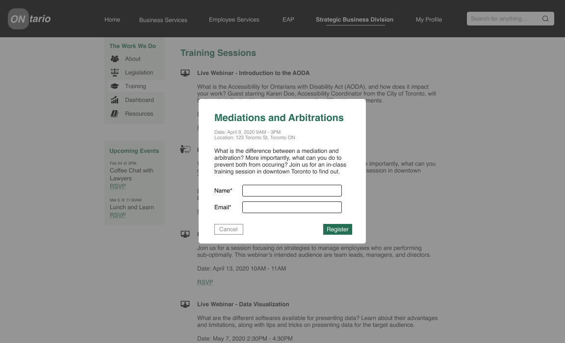
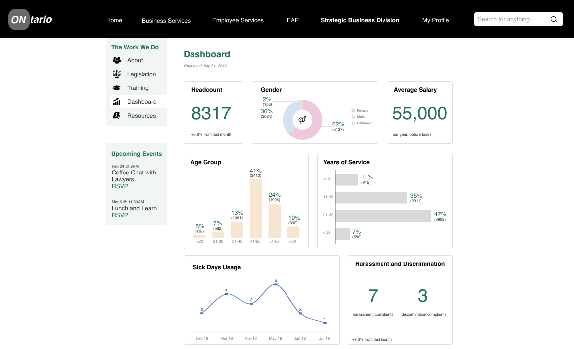
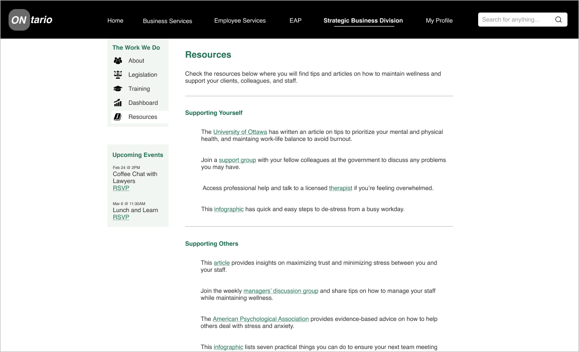
Below slideshow contains the final version of the website with select screens:
| Challenges and Lessons
At times, it was challenging to manage scope creep from other managers and stakeholders, meaning that I had to explain that new ideas (especially those that weren't related to the website at hand) could not be incorporated at the time. It felt uncomfortable saying "no", but I managed expectations by having clear and professional communication, and helped them understand that certain ideas had to be backlogged instead of added to the website immediately.
I'm glad to have had the opportunity to build positive working relationships and to build confidence in myself, and it felt good to know that I prioritized my schedule and completed the project within the original timeframe.
| Up Next
Thank you for reading! Take a look at my case study on redesigning a mobile app to create tier lists here.