
Creating Job Search App
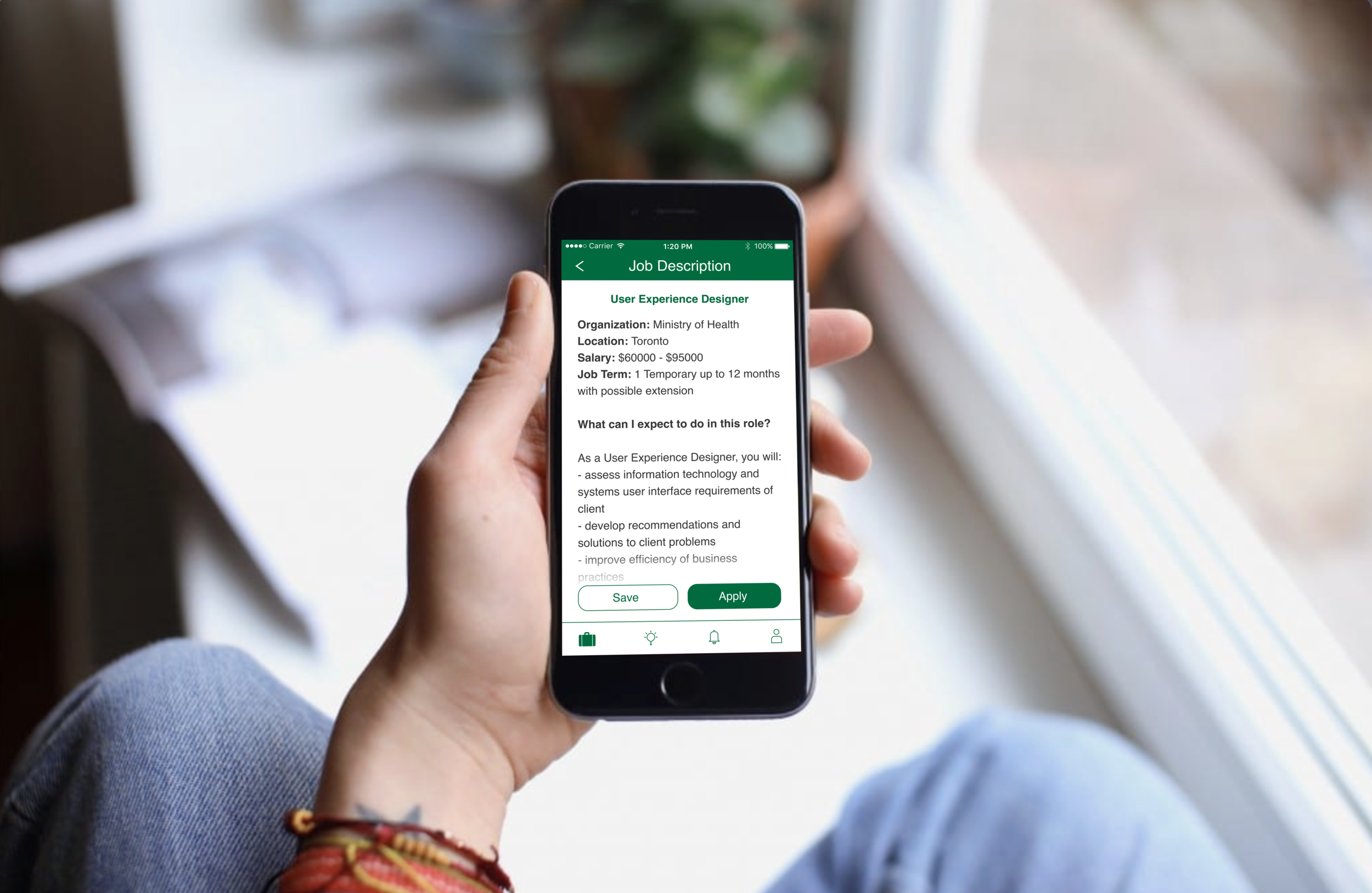
This is the story of how I designed ONJobs, a mobile app that improved the users' job search experience and facilitated the recruitment process.
To comply with the NDA, confidential information has been omitted and obfuscated. This case study is published with the approval of the Government of Ontario.
CHAPTER ONE
OVERVIEW
| At a Glance
My Role User Experience Designer at the Government of Ontario
Challenges Constraints with UI
Similarity with other apps
Impact Resolved 4 major pain points
Improved user experience
| The Problem
Through a survey, the Recruitment Division at the Government of Ontario realized that employees perceive the internal job application process to be frustrating and cumbersome. They realized there was a gap between the current practice and target goal.
How might we facilitate the internal recruitment process to increase employees’ satisfaction?
| Our Goal
After a thorough discussion with management and stakeholders, we decided that developing a mobile application for recruitment brings the most value, without compromising the benefits of current recruitment practices. This would also help the Recruitment Division achieve their goal of being perceived as modern, forward-thinking, and embracing the digital age.
This project's scope was to identify the content and user flow for a new mobile app, map the potential solutions based off that research, and design the interface.
| My Role
I set out to design an app that was intuitive and delightful to use. The platform was iOS, as the iPhone 6s was the workplace-issued mobile device.
I worked on this as the sole designer from December 2019, and stopped working on the project in July 2020 as the app started to be built. As I accepted another employment opportunity in the same month, I did not see through the development of this app.
My design process for this project is shown below:

CHAPTER TWO
RESEARCH
| First Things First
I was first tasked with submitting an Information Note to the Director for approval:
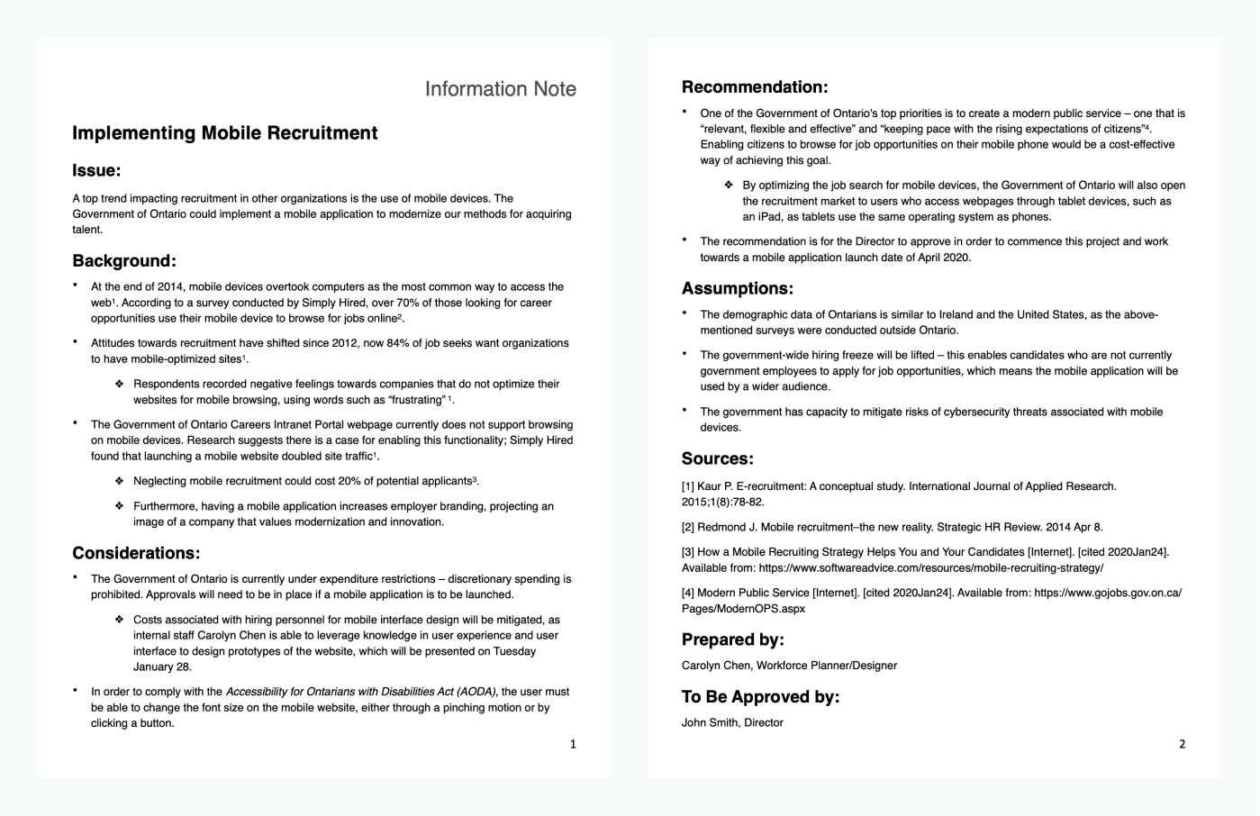
Once the project plan was given the green light, I thought it would make sense to conduct a user needs assessment first. Through my previous research, I had found that over 70% job seekers use their phone to apply for jobs in the USA, but I wanted to make sure the same would apply to employees at the government.
I used Qualtrics to send out a survey to 38 participants:
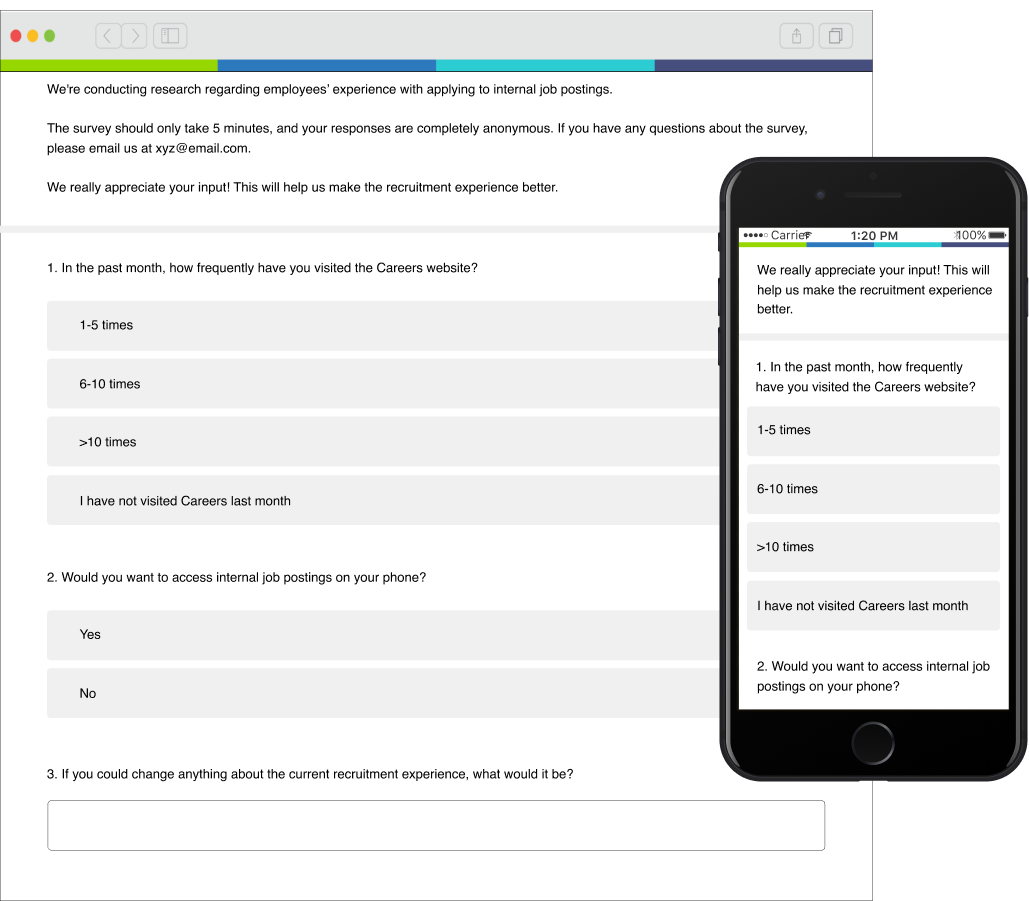
Out of the 61% of participants who responded, 94% indicated they would like to have the ability to apply for internal jobs on their mobile devices - this confirmed there is was fact a user need.
| Understanding and Empathizing
From the 23 respondents, five indicated in their response that they would be open to further discussions about their experience with finding internal jobs.
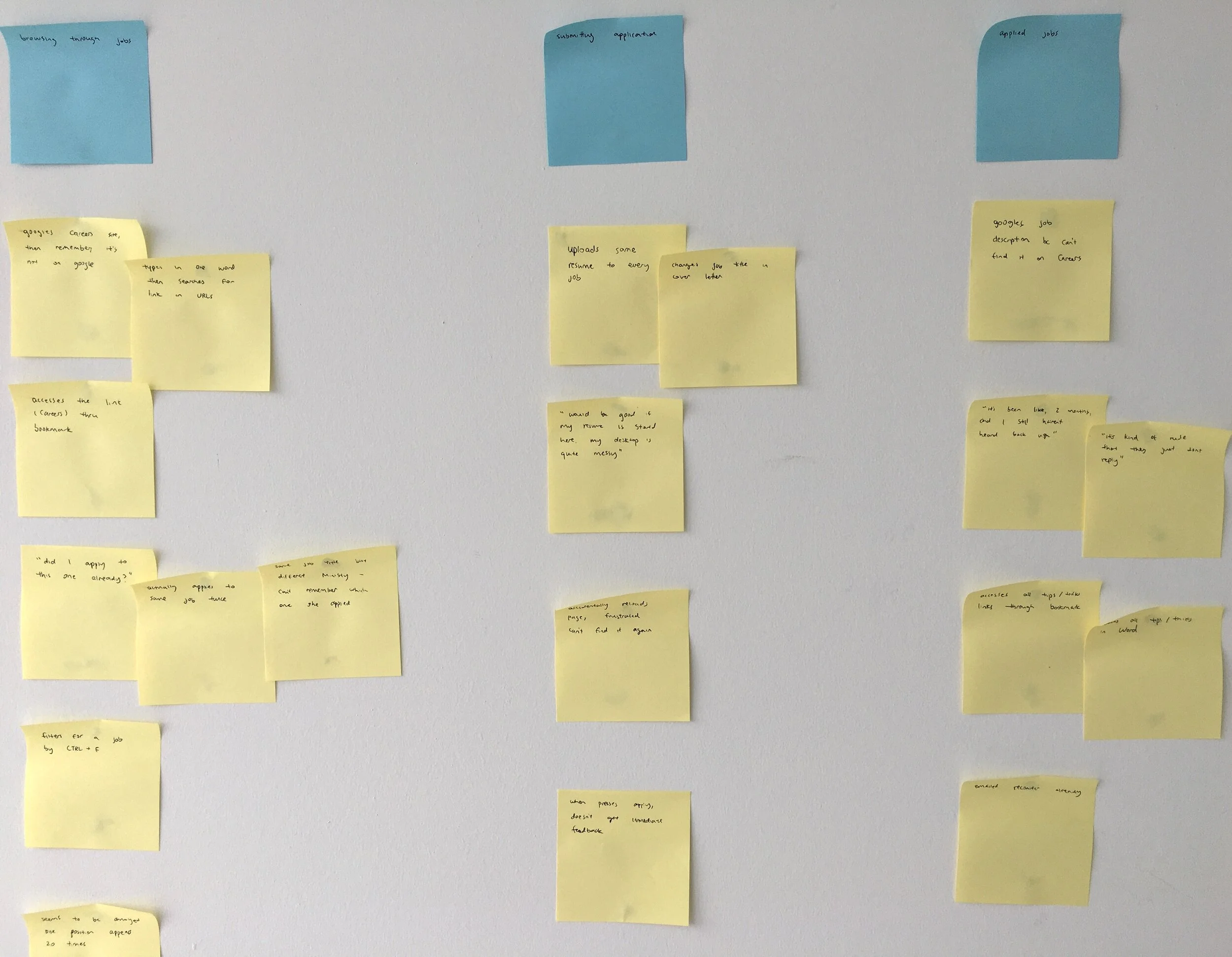
I scheduled two user interviews and three contextual inquiries to better understand the employees' behaviours, attitudes and emotions towards the current recruitment website, along with their motivations and frustrations, and ended up with a good amount of data:

I construed an affinity diagram because it was the best way to organize the responses thematically, which allowed me to derive insights:
CHAPTER THREE
SYNTHESIZE
| User Insights
After parsing through the data obtained from user interviews and contextual inquiries, the following user needs emerged (please note that I have intentionally obfuscated confidential data here):
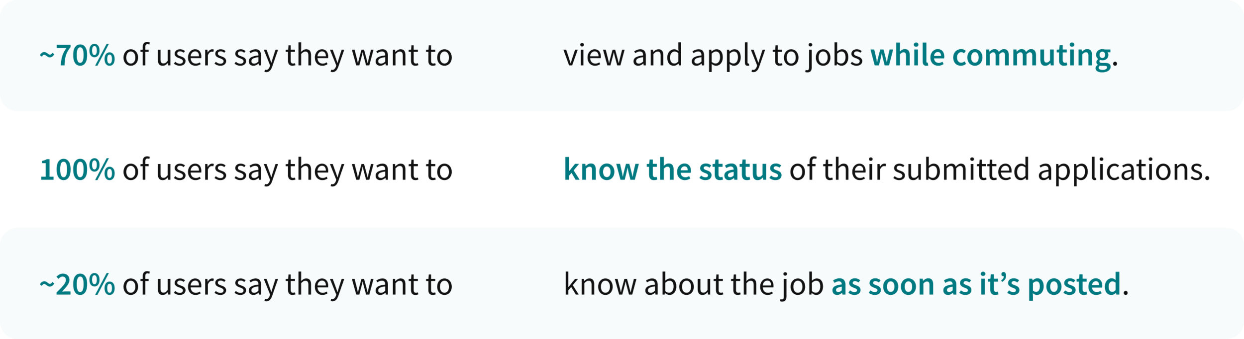
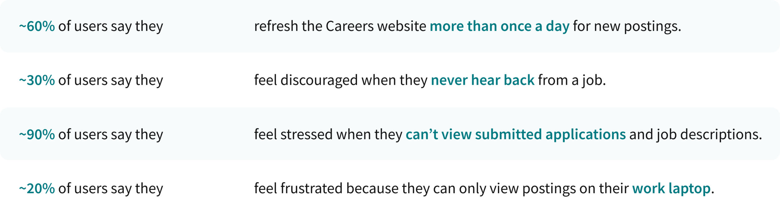
There were also key insights gathered about the struggles most job seekers faced (again, I have intentionally obfuscated confidential data here):
| Persona Creation
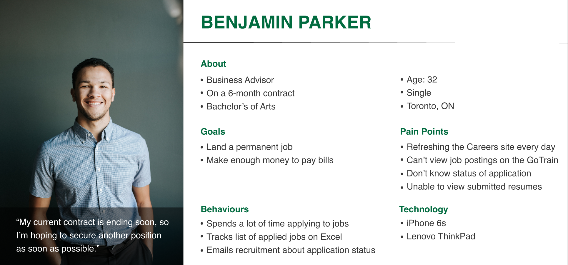
After speaking to employees and observing how they browsed for internal jobs, it was evident that there were some key struggles shared among most individuals. The insights were compiled into a persona, Benjamin Parker, who was considered first in any design choice:
| User Stories
The data informed the creation of user stories in order to reflect Benjamin’s steps in applying for jobs, and to highlight the potential capability of an mobile interface that would help make the process less daunting:

| Posting Jobs
I originally also wanted this app to be used for posting jobs too.
However, most individuals wouldn’t have access to the page where one can post jobs, as that function is reserved for human resource personnel only. So then I interviewed with some HR folks, and 100% of them indicated they would be posting jobs on their computers rather than phones.
Since there was no user need for this functionality, I decided to focus on the job seekers only and scraped the secondary persona.
CHAPTER FOUR
IDEATE
| User Flow
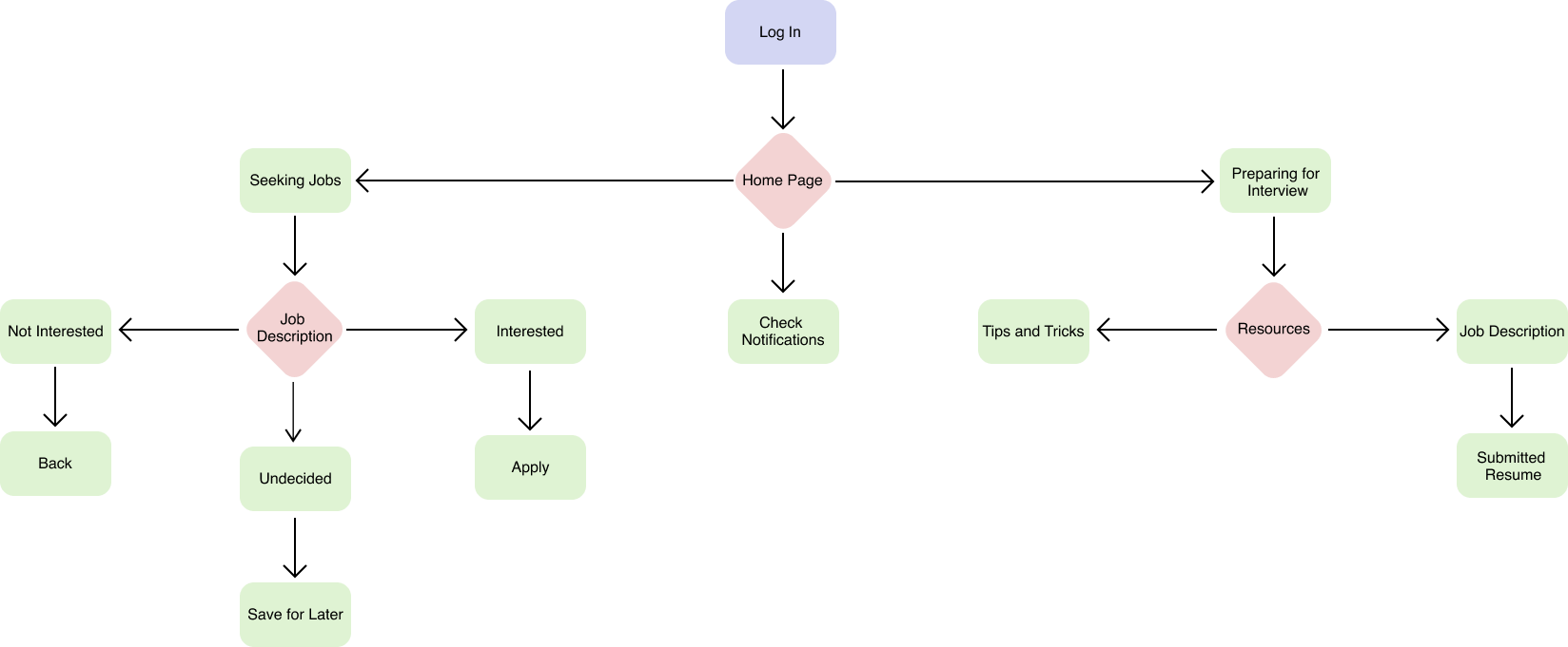
After understanding user needs and goals, a user flow was created in Miro to specify the required processes and to better understand the functionality of the app (simplified version recreated and shown below):
| Mobile App vs Mobile Website
The last question I needed to answer before sketching wireframes was whether a mobile app or a mobile-optimized website would best meet the needs of the users. An app was chosen for two reasons:
- notification system - many survey respondents indicated a desirable feature is the ability to receive job alerts, such as when a new position became available, or when the recruiter viewed their submitted application. This is a feature lacking on the current recruitment website, and it would work better on an app compared to a website;
- accessible without VPN - the current recruitment website is nested within the government’s private enterprise network, which means having a mobile app would overcome the need for VPN.
I connected with the Communications Division to ensure that designing a mobile app did not pose any security or privacy concerns, in which they gave the green-light (as long as the app contains only information related to recruitment, such as job titles, descriptions, and salaries).
| Sketches
After getting feedback from colleagues and managers regarding the user flow, making sure everyone is on the same page and having the main features decided, I documented inspiration from popular mobile apps that help candidates find jobs (e.g. Linkedin and Indeed), and noted the functionalities and UI components that seem to work.
With the core task focused on applying for jobs, I began sketching different ideas for the app:
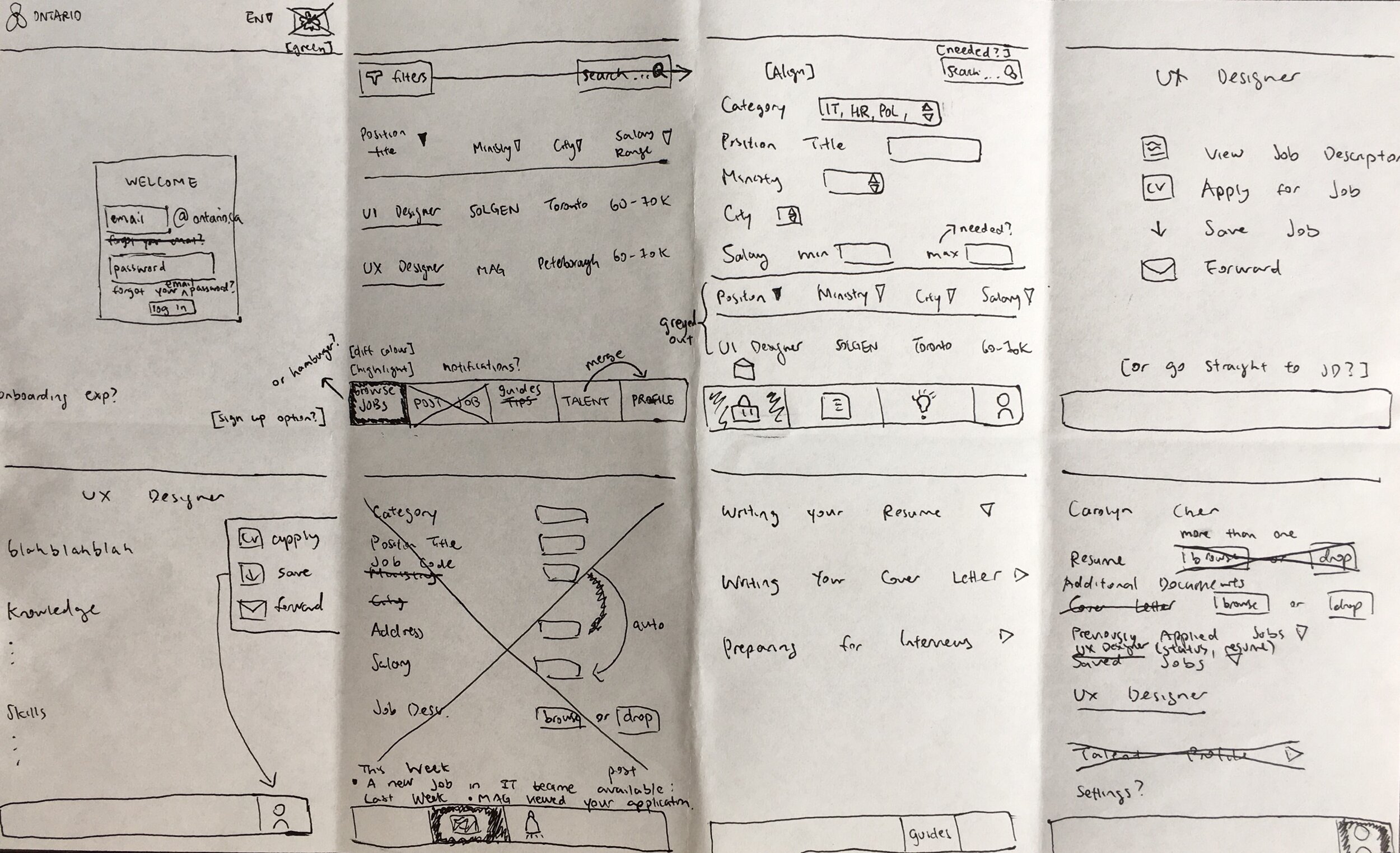
With the appropriate screens pulled, I translated them into a paper prototype using the Pop by Marvel app to get a general idea of how it would look on a mobile screen, before creating high-fidelity prototypes.
CHAPTER FIVE
PROTOTYPE AND TESTING
| Constraints with UI
The Government of Ontario had a handbook on design guidelines in which all designers followed.
This meant that there were some constraints with how the user interface looks:
- colour - the colours had to be restricted to green, white, and black. I ensured the colours balanced each other out and the green was not too overwhelming;
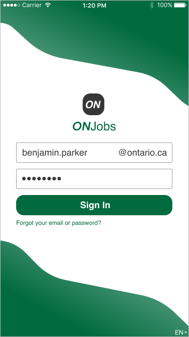
- registration - since individuals needed a valid @ontario.ca email address to access the app, I thought having a registration button would be confusing. However, in order to make it clear that you need to be an employee to use the app, I added the domain name to the email field (and made sure to test this with users).
| High-Fidelity
I used Figma to design the hi-fi experience. There were four iterations in total, with the fourth screen being the final version:
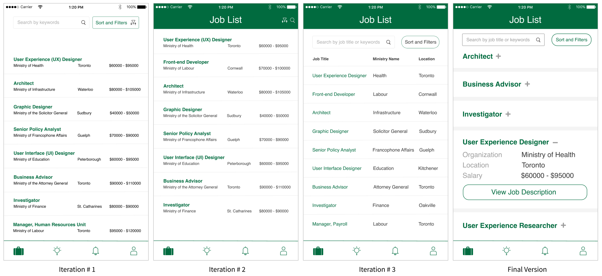
Each iteration changed based on feedback gathered from remote user testings and questionnaires (please note that I have intentionally obfuscated confidential data here):

| To Modify or Not to Modify
It was at times difficult to decide which user feedback to incorporate or not. For example, a few users indicated that they would like to see the menu bar on the top of the screen, so that it flows more naturally from menu to text.
However, the Thumb Zone (the surface area of a phone screen that is most reachable by your thumb) is located at the bottom of the screen, which means the menu bar would be more accessible where it currently is and would allow for quicker navigation.
GENERATING SOLUTIONS
| Pain Point #1: Refresh, Refresh, Refresh
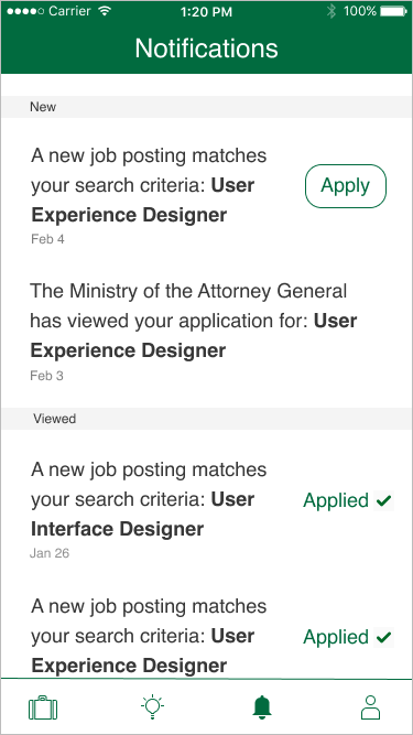
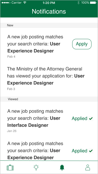
Previously, users spent a lot of time refreshing the website for new job postings. As a solution on the mobile app, I created a Notifications page to reduce the users' mental load of checking for updates.
| Pain Point #2: Should I Keep Waiting?
Some users felt discouraged when they haven't heard back from a job in a few months. I inquired with human resources on whether there is a way for candidates to receive status information on the jobs they applied to, but unfortunately they were not on board with the suggestion.
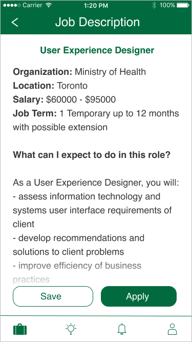
If approval is obtained one day, what I would do is to design the job description page so that it has a one-liner on top which would indicate the status; for example, whether interviews are in progress or if a successful candidate has been found.
| Pain Point #3: What Did I Submit?
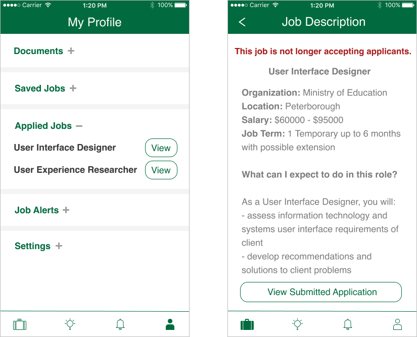
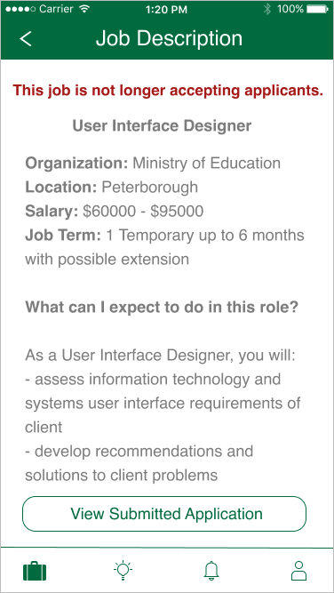
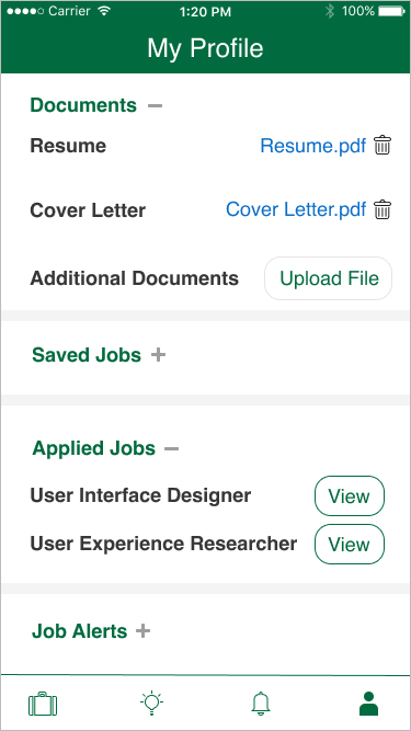
Previously, most users indicated they would like to see the resume they submitted for applications and job descriptions so they can prepare better for interviews. As a solution on the mobile app, I created a page to show applied jobs so users don't have to store the info themselves:
| Pain Point #4: Viewing Postings On-the-Go
The final struggle most job seekers experienced was that they could only access postings on their work-issued laptop, hooked to internet and VPN. By designing a mobile app, this would allow candidates to apply to jobs whenever they are, adding a layer of flexibility that didn't exist previously.
CHAPTER SIX
CONCLUSION
| Final Designs
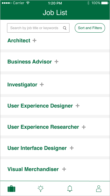
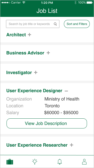
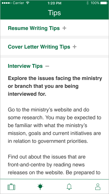
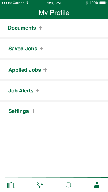
Below slideshow contains the final version of the app with select screens:
| Current Status
I have handed off the comprehensive prototype to the developer in July 2020, but did not see through the development as I accepted a job offer shortly afterwards. If I was still employed by the same organization, I would have conducted usability tests to continuously iterate the app.
I also planned on collecting statistics in order to evaluate metrics such as:
- session depth - the time it takes and how close users get to the target action (for example, applying to a job);
- active users - the number of people who use it every month, as a low number could signify that applying to jobs on the web is more preferable;
- churn rate - how many users abandon the app, as it could signify that the app crashes often or is buggy.
| Challenges and Lessons
An unexpected challenge I encountered was that I was trying too hard to make ONJobs look like the popular existing job search apps. There were times when I had an idea, but scraped it because the popular apps weren’t doing it (however, after the final prototype was delivered, I pursued some of the ideas further in my own time).
Although doing market research in the beginning helped me ensure I wasn’t missing any major components, I feel like one thing I could have done differently was to not view the other apps so many times throughout the design process, and allow myself to have more creative freedom.
| Up Next
Thank you for reading! Take a look at my case study on redesigning a website at the Government of Ontario here.